And Also
//RE-BRANDING STRATEGY, VISUAL IDENTITY, PACKAGING DESIGN
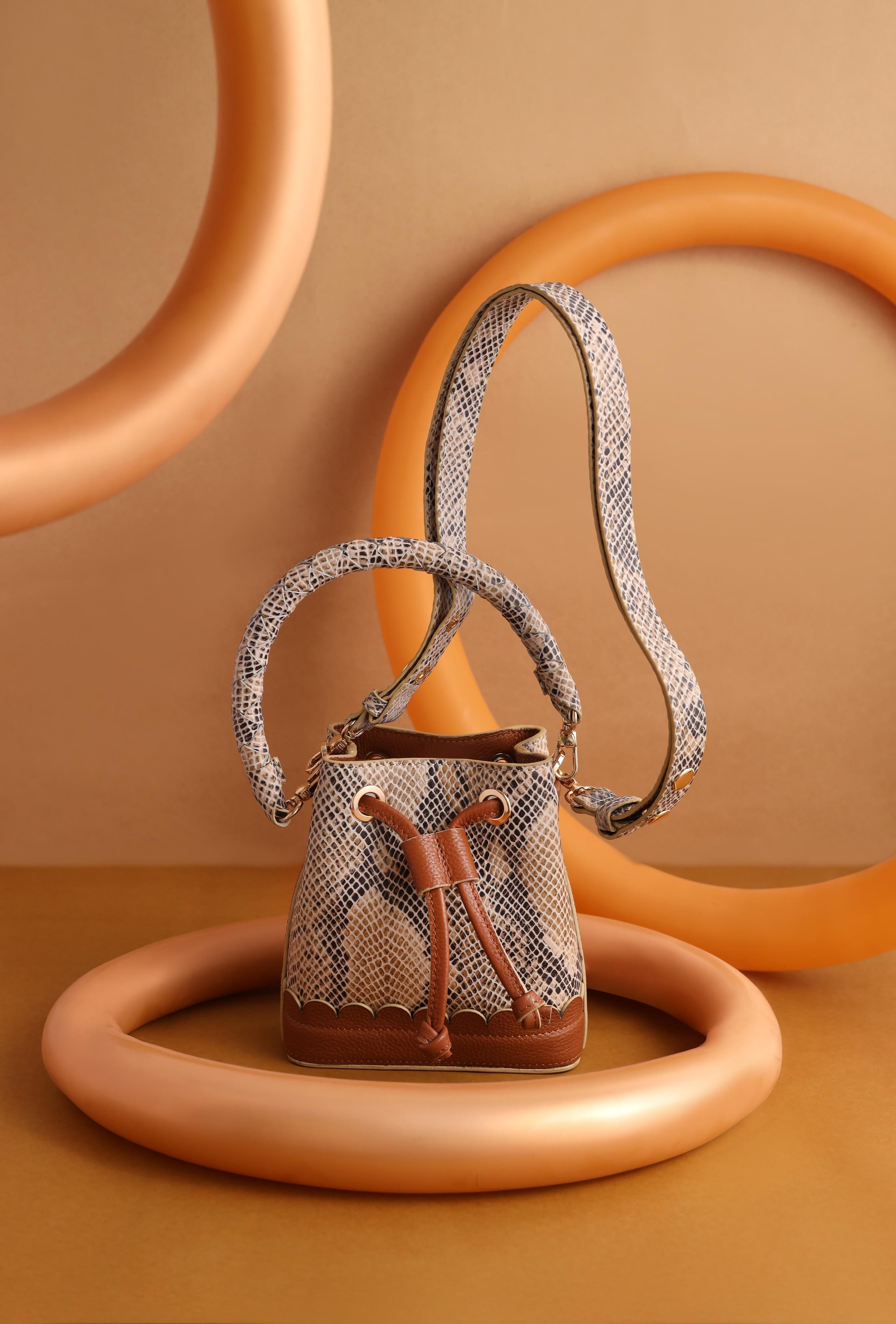
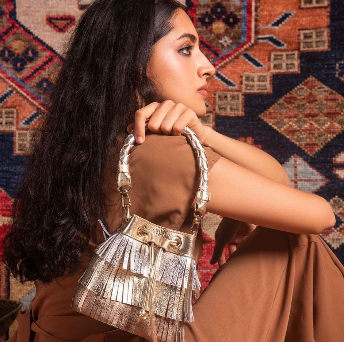
And Also is a brand of functional and fashionable accessories like leather body belts, handbags, and customisable leather accessories. They believe that anyone can express their unique style through their products, making feeling fashionable effortless and accessible.
Deliverables: Brand Strategy, Visual Identity, Visual Language, Packaging Design
The Challenge
As the brand evolved through multiple collections, a disconnect emerged between its initial identity and its current direction. The target audience, product offerings, and overall brand communication felt increasingly misaligned.
The founder struggled to bridge the gap between the established brand language and the evolving preferences of the audience, making it difficult to forge a meaningful connection.
Moodboard for Re-Branding


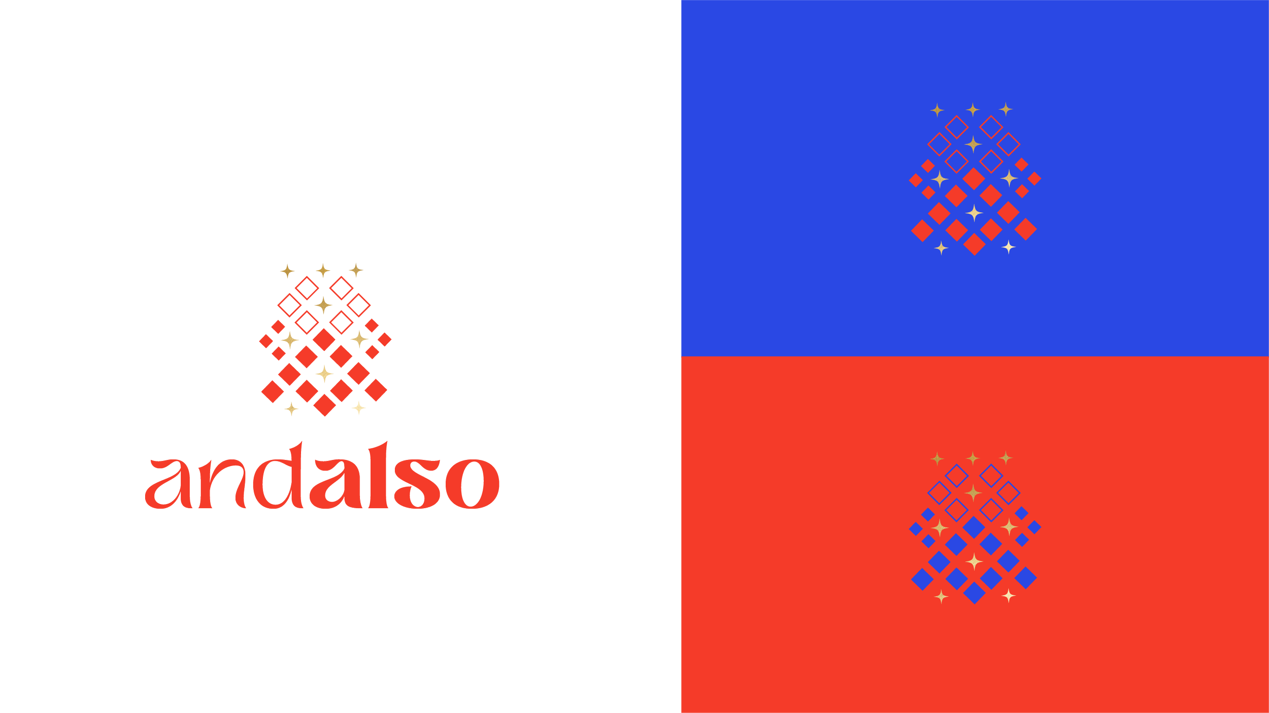

Other iterations for the Identity
The Solution
We embarked on a journey to reimagine And Also as a fun, millennial-focused, and approachable brand that transforms the ordinary into extraordinary.
We redefined the brand's vision to emphasize self-expression, individuality, and the joy of accessorizing. The new vision embraced the idea that style is a playful and accessible tool for everyone to elevate their everyday look.
We shifted the focus to recognizing our target audience’s desire for unique, trend-driven accessories that are both fun and functional. This involved understanding their lifestyle, values, and how they engage with fashion.
And Also evolved from a formal, aspirational brand to a fun-loving, quirky, and relatable friend. This personality was reflected in the brand's voice, messaging, and visual identity.
Branding thought
Spotlight
Highlight your everyday style. Get used to being the show stopper!
Before
After


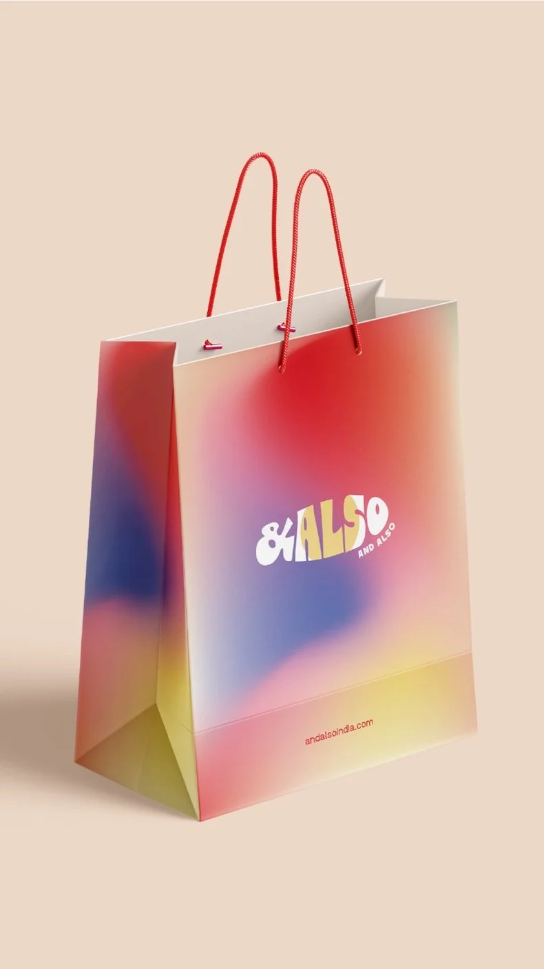
Brand Colours and Gradient
The palette is bold enough to stand out, yet approachable enough to resonate with a young audience. Red makes a statement, symbolizing confidence and energy. The complementary pink softens the palette, adding a friendly and approachable touch. Pop of yellow serve as highlights, injecting a sense of optimism and lightheartedness. The indigo blue is a contrasting accent.

Brand Typography
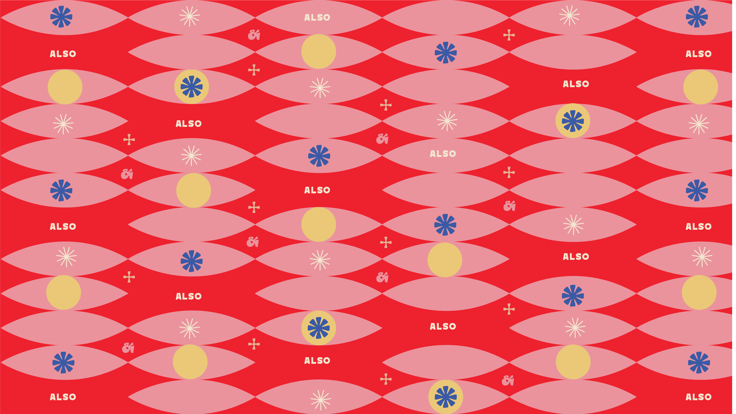
A combination of fun, bold and simple typefaces to bring out the diversity of the brand.
Collection name lock up 1
Collection name lock up 2
Bringing you in the spotlight
⋆
Ordinary to extraordinary
⋆
Bringing you in the spotlight ⋆ Ordinary to extraordinary ⋆

Logo mark and variations


